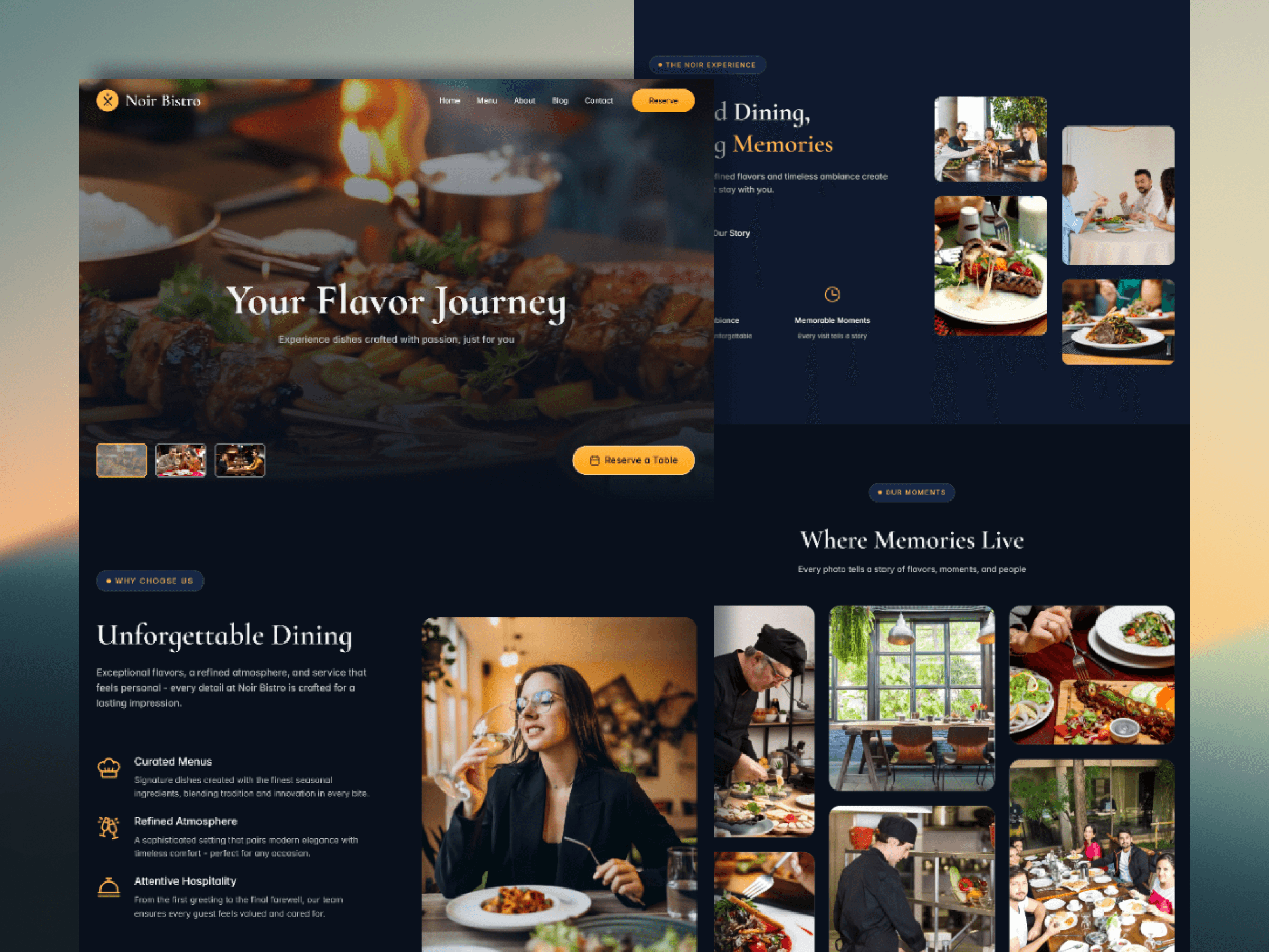
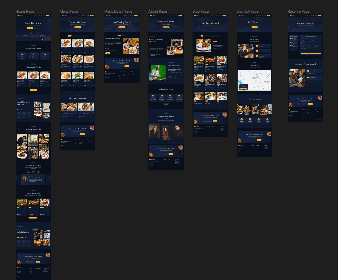
Noir Bistro

Translating the intimacy of fine dining into a digital experience. A dark, refined website that mirrors the restaurant’s atmosphere.

Translating the intimacy of fine dining into a digital experience. A dark, refined website that mirrors the restaurant’s atmosphere.

Translating the intimacy of fine dining into a digital experience. A dark, refined website that mirrors the restaurant’s atmosphere.

Role

Role

Role

Lead Designer & Developer

Lead Designer & Developer

Lead Designer & Developer

Tools

Tools

Tools

Figma, Framer

Figma, Framer

Figma, Framer

Timeline

Timeline

Timeline

8 weeks, 2025

8 weeks, 2025

8 weeks, 2025

Project Overview

A digital extension of the dining room

Noir Bistro approached me with a clear vision: their website should feel like stepping through the restaurant's front door. Dark, considered, and unmistakably refined.

The challenge wasn’t just aesthetic. First-time diners needed to understand the experience before booking. Returning guests needed fast access to menus and reservations. The design had to balance aspiration with approachability.

The Brief

Create a digital presence that reflects the restaurant's intimate, upscale ambience while making it effortless for guests to explore the menu and secure a table.

User Research

Understanding the journey

I spoke with restaurant staff and reviewed analytics from their previous site. The patterns were clear: guests wanted inspiration, not information overload.

Guest Expectations

High-end diners expect seamless digital experiences that mirror the physical environment - no clutter, no confusion.

Menu Discovery

Users want to explore the menu visually before arrival, with clear categorization and seasonal highlights.

Reservation Flow

Booking should feel effortless - three clicks maximum. Any friction translates to abandoned reservations.

Design for dual journeys

Fixed navigation with persistent reservation access for regulars. Rich, scrollable homepage for first-timers to absorb the experience at their own pace.

Performance first

The site had to load fast and feel light, despite the dark aesthetic. Every motion needed to serve navigation or provide feedback, never decoration.

The clear version :

Refining Design

At this stage, the focus shifted from exploration to precision. Using insights from earlier research, I translated the concept into high-fidelity website layouts that represented the final Noir Bistro experience as accurately as possible.

Rather than designing screens in isolation, I treated the site as a continuous journey - ensuring hierarchy, spacing, and interaction patterns felt consistent from entry to reservation.

Mockups

These are a high fidelity design that represents a final product

I designed high-fidelity website mockups covering all primary pages, focusing on typography, spacing, color, and component consistency. The goal was not visual excess, but clarity, ensuring each screen supported the brand’s refined tone while guiding users naturally toward menu exploration and reservations.

Main page, web
Main page, web

Key Design Decisions

01

Typography as hierarchy

Size and weight were used instead of color to establish hierarchy. Each scale step reinforced information priority.

02

Restrained motion

Only two animation patterns: fade-up on scroll for content reveal, and scale-on-hover for interactive elements.

03

Generous spacing

White space as the primary design element - letting each section breathe.

Style Guide

A system built on restraint

A minimal color palette, scale-based typography, and consistent spacing, intentional at every touchpoint.

Color Palette

BG Primary

#09101C

BG Secondary

#0F192EE

BG Surface

#172747

BG Muted

#84888F

Primary Text

#F3F3F4

Secondary Text

#BABCC0

Primary Light

#FDD798

Primary

#FDBA4D

Primary Darker

#FCA311

Border / Divider

#474D57

Accent

#3DCC44

Alert

#E6583F

Typography Scale

Heading 1

80 px

Weight 500

Main headings

Heading 2

56 px

Weight 400

Section headings

Heading 3

44 px

Weight 400

Section titles

Heading 4

32 px

Weight 300

Section titles

Heading 5

24 px

Weight 300

Card title

Body - XL

20 px

Weight 300

Body Copy

Body - LG

18 px

Weight 200

Body Copy

Body - M

16 px

Weight 200

Body Copy

Body - Small

14 px

Weight 200

Body Copy

8px grid foundation

Sections: 128px • Blocks: 96px • Components: 24–32px • Micro spacing: 8–16px

Motion with purpose

Hover: 1.02 scale • Focus: 2px border • Transitions: 200ms ease-out • Max: 400ms

Outcome & Impact

A digital presence that performs

Launched July 2025. Early signals showed strong engagement, with the website frequently cited as a factor in booking decisions.

47%

Increase in online reservations

2.3min

Average session duration

89%

User satisfaction score

Reflection

What I Learned

Intelligent design tools accelerated iteration but didn't replace judgment. The time saved went into refinement - testing layouts, adjusting hierarchy, ensuring cohesion.


Dark mode isn't just inverted colors. It requires rethinking contrast, managing visual weight, being intentional about emphasis.

Future

What's Next

Private Events Section

Extending the system to showcase exclusive dining experiences and event booking.

Seasonal Menu Configurator

An interactive tasting menu builder that maintains the refined aesthetic.

Usability Testing

Testing with first-time diners to refine discovery flow and conversion.

Let me help with a great visual solution for your business.

To get in touch :

Contact Me

Set up a time to talk about your design needs.

Follow me on:

Click to copy :

hello.shiponstudio@gmail.com

Let me help with a great visual solution for your business.

To get in touch :

Contact Me

Follow me on:

Click to copy :

hello.shiponstudio@gmail.com

Create a free website with Framer, the website builder loved by startups, designers and agencies.